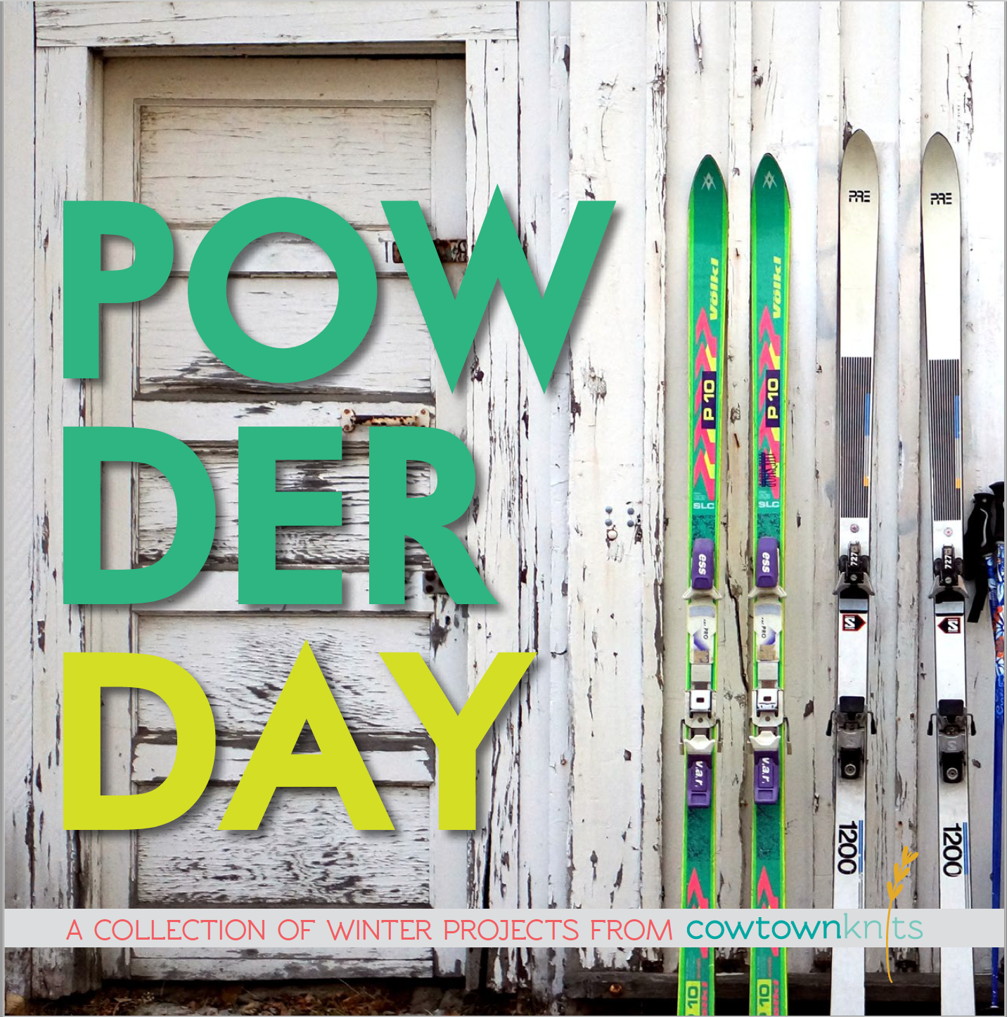
Client wanted a logo for her knitting design brand as well as two book designs that extended the use of that new branding.

The wheat stalk graphic in the logo makes a playful reference to the idea that cow towns are where hayseeds live. The grains on the wheat stalk are in the shape of knit stitches.